

107
PUBLICATION DESIGN // MOTION DESIGNThis two-part project began with the creation of a custom wordmark and identity system, then expanded into a full publication. 107 takes its name from Formula One’s “107% rule,” where drivers must meet a qualifying lap time to compete. That idea of precision and speed shaped the typographic choices, grid structures, and visual rhythm throughout the spreads. This publication balances hierarchy and legibility with high-energy design, while showing how typography can both inform and embody its subject.
DISCIPLINES: BRANDING, TYPOGRAPHY, MOTION
the wordmark
The wordmark for 107 combines the fast, forward momentum of Formula One with the polished elegance that surrounds the sport. Its form captures both speed and exclusivity by merging sharp, dynamic shapes with refined details. This balance between motion and luxury establishes the identity of 107 and sets the foundation for the publication’s typographic voice.
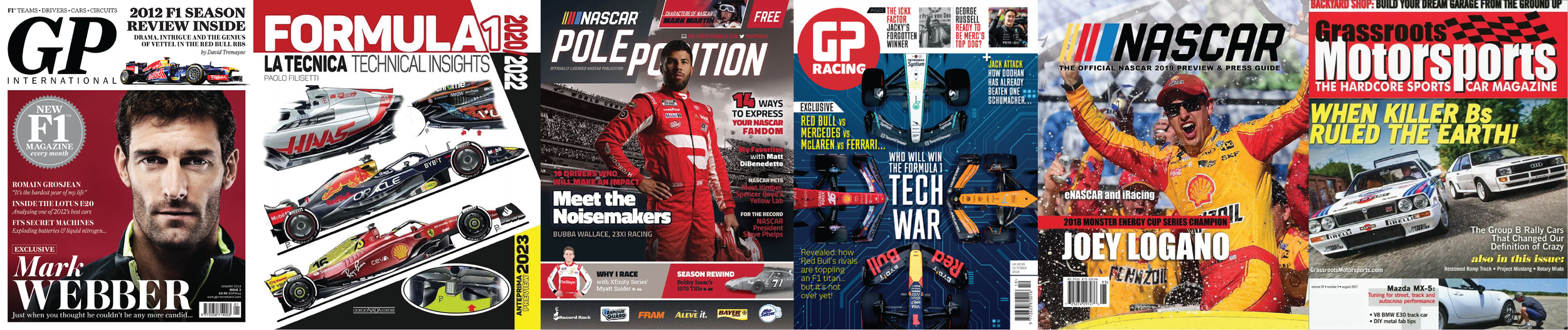
Research was done to explore what the wordmarks for other racing publications looked like. 107 is meant to have a heightened level of sophistication, while still appealing to the fast side of the sport.
SKETCHING
EXPLANATION OF 107
A statement to describe the overall theme of the publication was created and iterated upon. This statement was referenced throughout to ensure that the wordmark was accurately conveying the message.
107 is a rich driver of speed that exudes a sharp and forward appreciation of Formula One racing and car design.
Conceptual directions were then identified. These words were also referenced to check that the ideations were headed towards a clearer depiction of the overall theme.
fast, neon, appreciative, speed, elite, sharp, forward, electric, bold, flashy, modern, exclusive
Typography was explored through numerous sites including Adobe Fonts and Google Fonts before moving to ideations with pen and paper.
TYPOGRAPHY EXPLORATION

Based off of typefaces found during typography exploration, tracing paper was used to make changes to the original typeface. The intent was to bring the type closer to the theme of the publication.
SKETCHING exploration

After narrowing in on the typeface Amandine, in bold italic, there was another round of sketching that allowed the exploration of serifs, angles and weight change.
refined sketching

digital iterations
Sketches were then moved into Adobe Illustrator and iterated upon digitally. The number one in particular, was iterated upon to further differentiate it from the number seven.

process gif
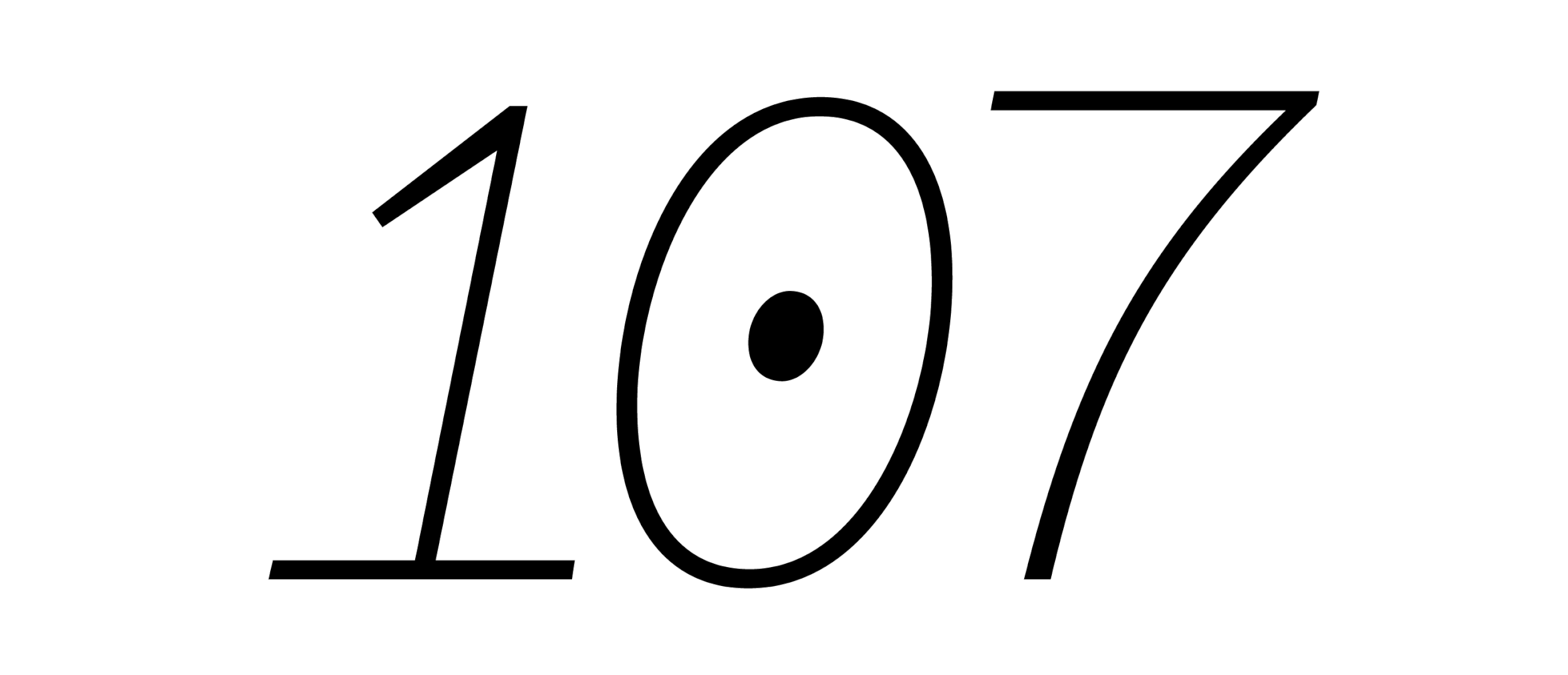
final wordmark

the publication
The development of 107 was an iterative process shaped by experimentation and refinement. Initial explorations focused on typeface pairings that could reflect both motion and elegance. As imagery was introduced, the system expanded into a structured set of global and local rules, guiding how text and visuals interact across spreads. The result is a publication that carries the rhythm, control, and intensity of Formula One.
This gif captures the evolution of 107 from early layouts to final spreads. It highlights how the publication took shape through constant iteration, refining grids, testing hierarchy, and balancing type with imagery. Each step was about fine-tuning the pacing and rhythm of the magazine, ensuring the final piece communicated both the precision and the energy at the heart of Formula One.
Process gif

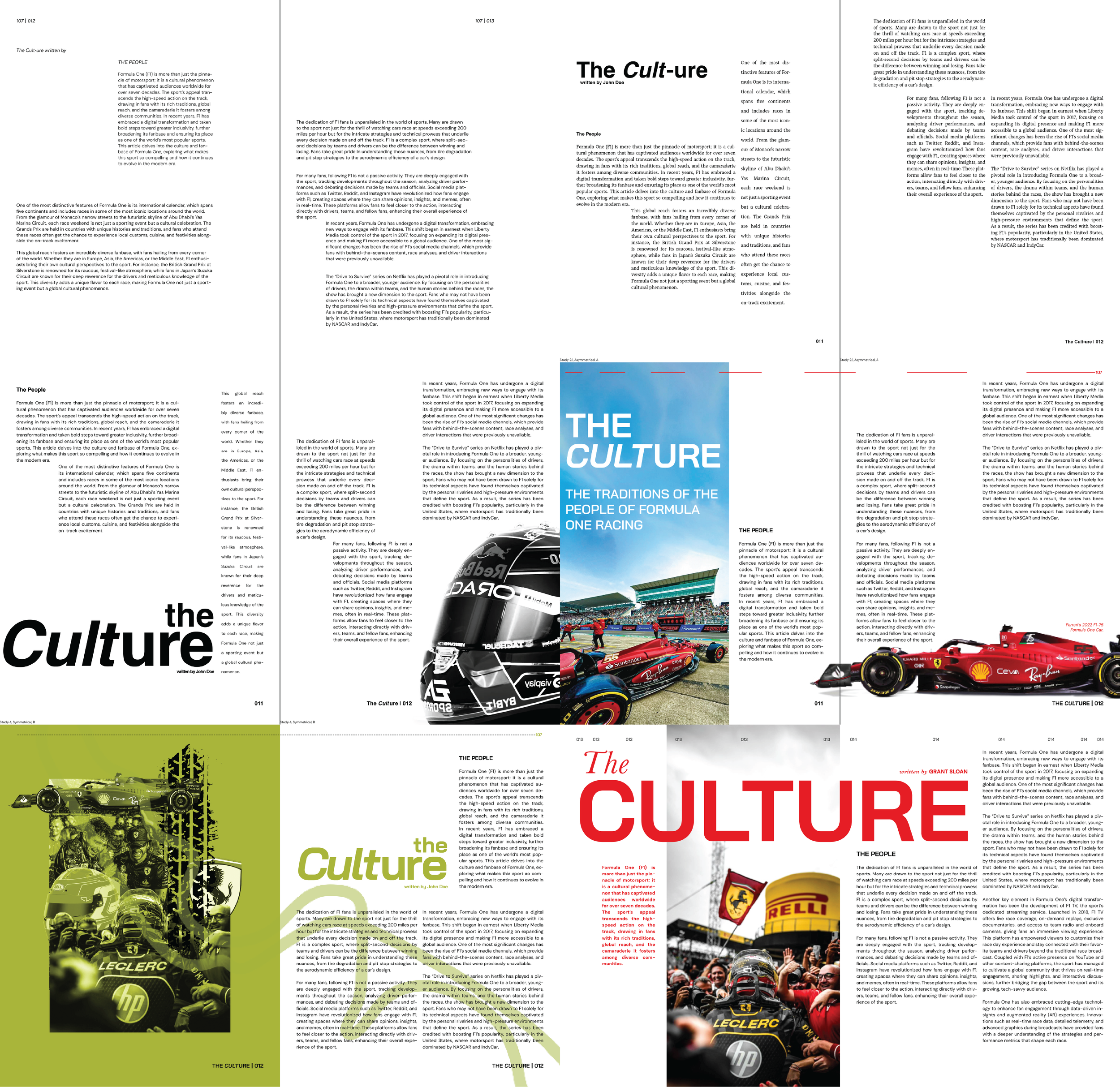
The completed spreads bring together refined typography, structured grids, and dynamic imagery. The final publication balances clarity with expression, embodying the energy and discipline of Formula One.
Final Layouts

interactive Digital magazine
After completing all the spreads, I created a digital version of the publication that could be clicked through, allowing viewers to experience the work interactively. This digital format preserves the typographic hierarchy, grid structures, and visual rhythm established in the print layout.
the broadcast
I created a short video to promote the publication, showcasing both its design and the topics covered. Using typography, pacing, and visuals from the spreads, the video captures the speed, precision, and sophistication of Formula One while giving viewers a dynamic overview of the issue.
You’ve come this far, might as well see…

SPRING + FALL 2025
HUseman group
co-op