

phoenix sky harbor international airport
UX + UI This UX/UI project focuses on creating a Flight Information Display System (FIDS) for the Phoenix Sky Harbor International Airport, tailored for viewing on an iPhone 14 Pro. This display delivers real-time flight updates to passengers departing or arriving at the airport. The central point of this project is to organize an effective information structure that can be utilized across macro and micro formats.
DISCIPLINES: TYPOGRAPHIC HIERARCHY, APP DESIGN
In researching six different airport interfaces, I noticed a recurring issue with legibility and spacing. Some screens were so spread out they only showed one flight at a time, while others were overly compact and difficult to read.
RESEARCH

Based on the previous research, I sketched to explore possible solution to these problems. I focused on the layout and the possible hierarchy of each group of type.
SKETCHING
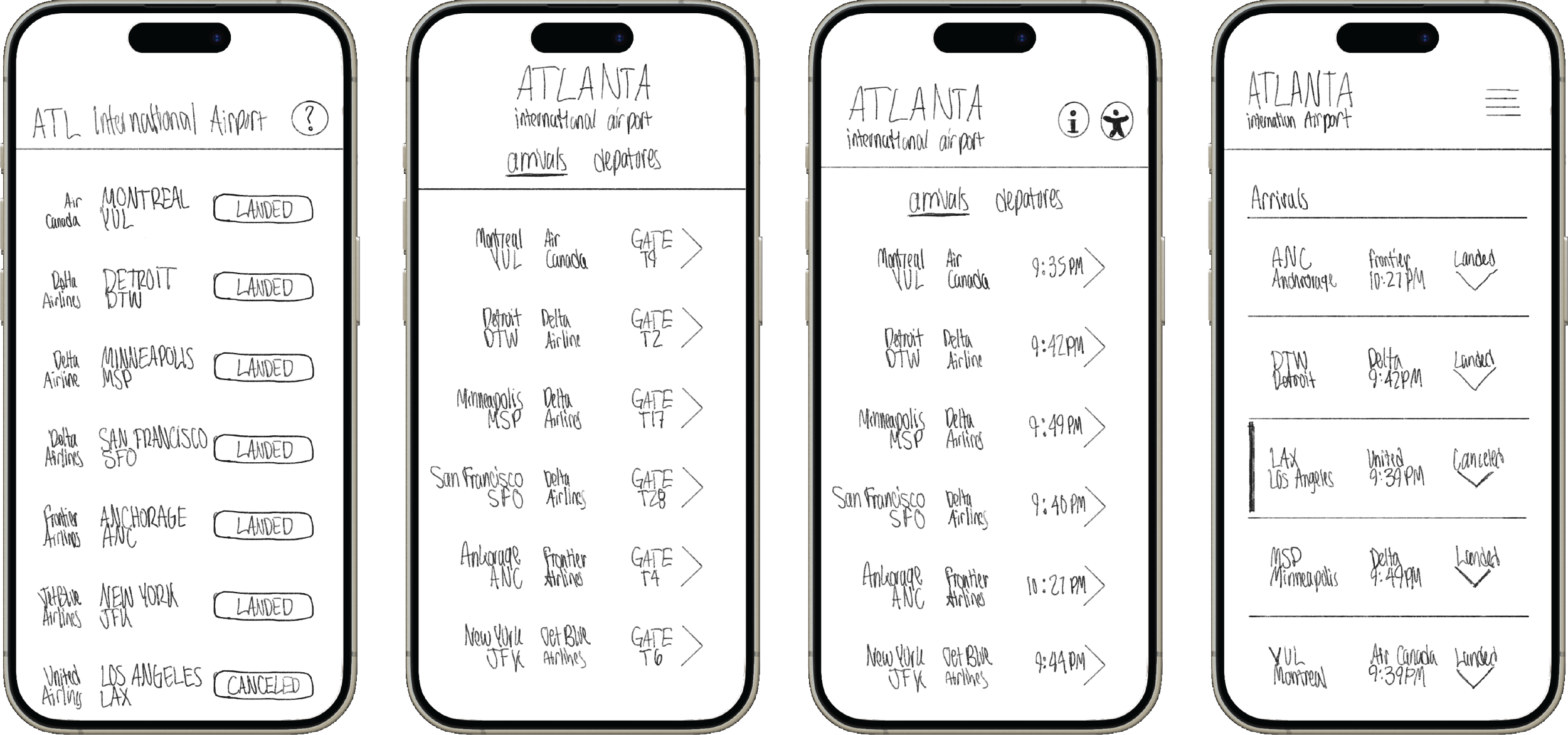
I then moved the most successful hierarchy and layout options into Adobe InDesign. From there, I worked with final graphic elements that would enhance the design rather than distract from it.
HIERARCHY EXPLORATION

COLOR & TYPOGRAPHY
The original interface used vibrant colors for visual impact, but I shifted to muted tones to improve accessibility and readability, ensuring key information is clear for all users.
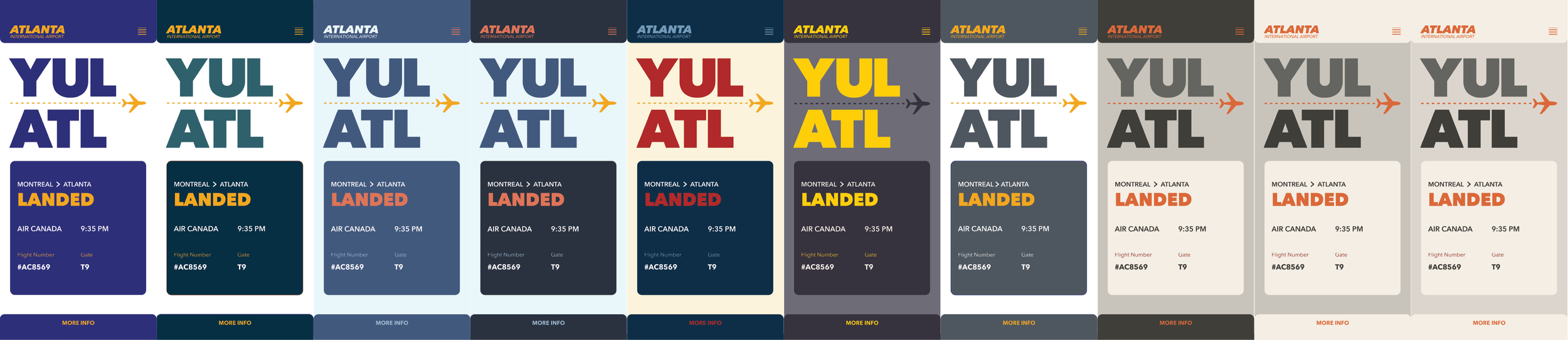


FINAL INTERFACE
THE 2025 UPDATE
This project originally reimagined the user experience of Atlanta International Airport, but in 2025 I revisited and elevated the work. By rebranding it as Phoenix Sky Harbor International Airport and introducing a refreshed color palette, the design gained a stronger identity and sharper context. The name shift allowed the project to stand on its own, rather than getting lost among dozens of student portfolios centered on Atlanta. Meanwhile, the updated palette brings more clarity, accessibility, and a modern aesthetic—making the interface more effective at guiding travelers while also feeling visually distinctive.
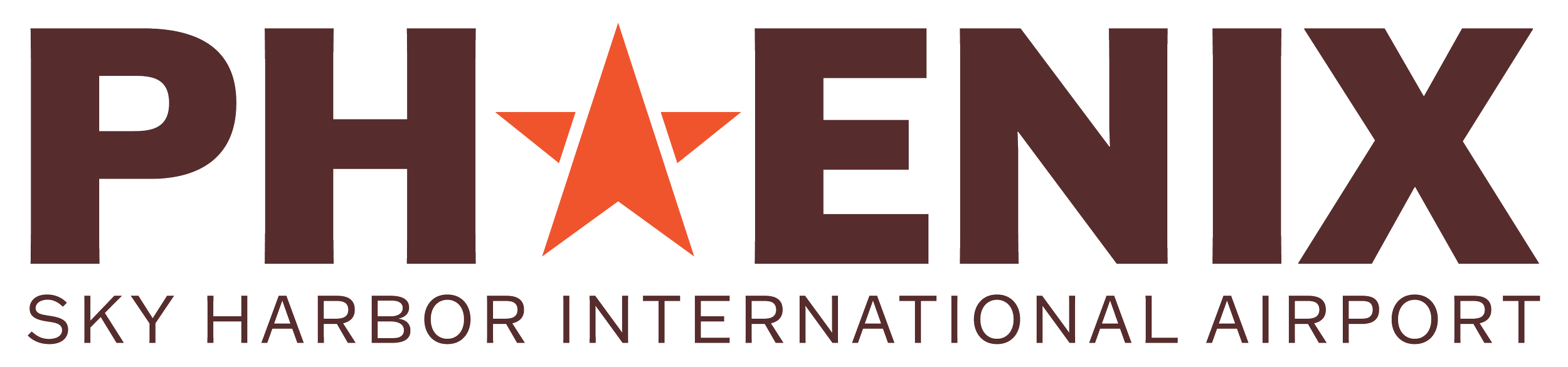
The new Phoenix Sky Harbor wordmark ties directly to place and purpose. The Arizona star grounds it locally, while the arrow signals navigation and travel. It’s bold, memorable, and tells the story of movement at a glance.
wordmark
This new palette reflects Arizona itself: warm maroon and orange tones, reminiscent of desert rock and sunsets. Turquoise tones trace back to native stone and mining history. The soft sand tones round out and balance the palette. The palette roots the interface in the landscape and rich culture of the state.
colorway


updated interface

While you’re already scrolling, might as well peek at…

SUMMER 2025
HUE
UX + UI