

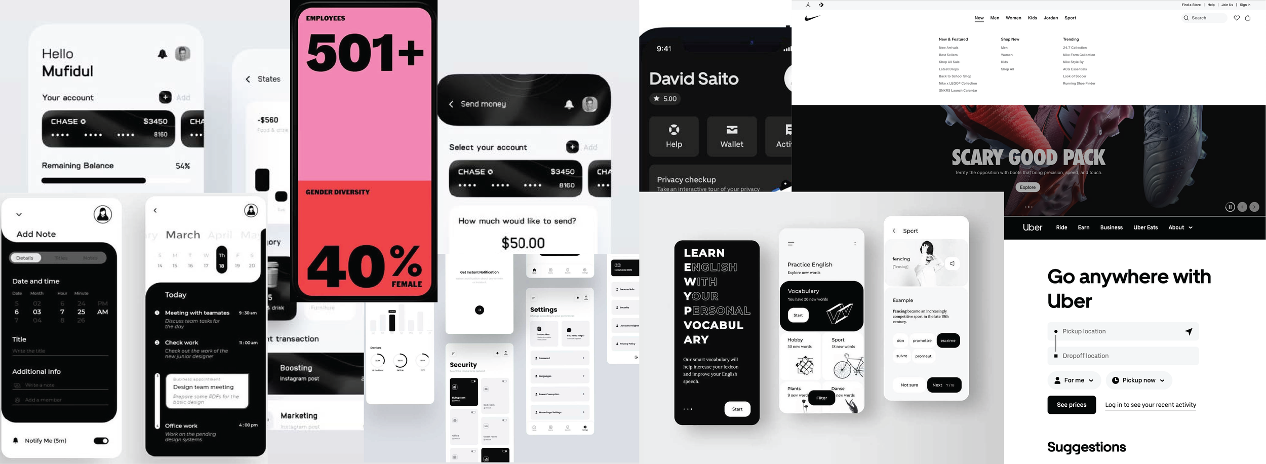
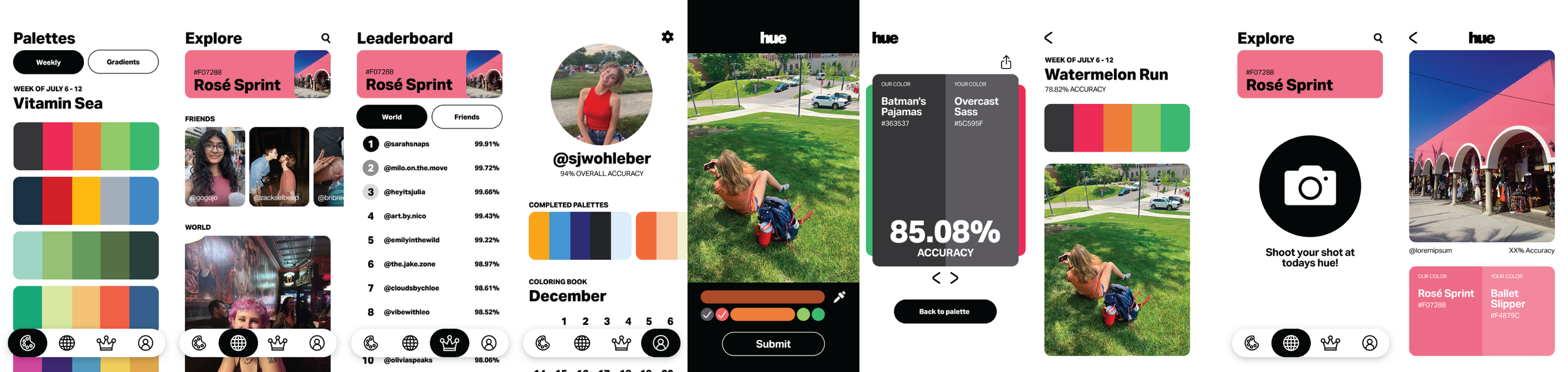
HUE
UX + UI Hue is a social photo-sharing game that turns daily color prompts into real-world challenges. Each day, players get a hex-coded swatch, snap a photo to match it, and use the eyedropper tool to test their accuracy. Scores, leaderboards, and alternative palettes keep the hunt competitive and fun. Designed for teens and young adults, Hue encourages exploration, creativity, and connection beyond endless scrolling. With a clean, photo-first interface, it transforms everyday colors into playful moments of discovery.
DISCIPLINES: APP DESIGN, BRANDING, TYPOGRAPHY
Most social apps keep users glued to their screens, scrolling endlessly without real-world engagement. Hue flips the script by turning color into a creative, movement-based game — getting users outside, snapping photos, and connecting through playful, real-world exploration.
problem statement
BeReal: In-app camera for enhanced photo editing and a memory page to track completed daily hues.
Lapse: Profile page with a large profile picture and grouped info; feed split between friends and global content.
Coolors.co: Organized color palettes for additional Palette task.
benchmarking

I created two very different user personas to guide design for a wide audience. Ash (22) is tech-savvy and expects a smooth app experience, while Sue (81) is moderately tech-savvy but highly competitive. Designing for both helped ensure Hue is accessible, engaging, and fun for all types of users.
user personas

I created two task flows to map out every step of the app experience. This helped me visualize the user journey and ensure that no part of the experience was overlooked.
task flows


I created a hyper-detailed site map to fully understand the structure and navigation of Hue. By mapping out every screen and interaction, I could anticipate user needs, identify potential gaps, and ensure the app’s flow was clear and intuitive from start to finish.
Site map
Sketching wireframes for the first time allowed me to quickly explore layout ideas and test user navigation. My goal was to create a simple interface, so wireframing helped me prioritize key features and visualize a clean structure before moving into digital design.
wireframe sketches

I chose a black and white color palette to keep the interface minimal and distraction-free. By removing competing colors, the focus naturally shifts to the photographs and color-centric activities, allowing users to fully engage with the visual content and the daily color challenges.
visual exploration
In developing the brand guidelines, I focused on creating a clean and cohesive visual identity. A clear typography hierarchy helped organize information clearly, guiding users’ attention to headings, subheadings, and body text in a logical way. Combined with a consistent font and rounded corners, this ensures the interface feels approachable while keeping content easy to read and navigate.
Style guide

While the image search was not hard, it filled me with joy. Asking my friends and family and even strangers to take a peak through their camera rolls in search of the color pink was something special. My peers were, in a way, playing the game. Hunting for pink while on their walks to school or on their nights out. This only strengthened my belief in the game. Taking a moment to look around you and hunt for a color as if you were a kid again is one of the most human things you could ever do. Since I couldn’t fit every image into the prototype of Hue, I still wanted to give them a place to shine.
Finding Images

While looking at these static wireframes may be exhilarating, I would highly recommend scrolling just a little farther to see the real thing!
Static wireframes
figma prototype
Spoiler Alert: this one is also pretty good…
FALL 2024
107
PUBLICATION DESIGN // MOTION DESIGN